 Cultivar
Cultivar Studio · Humboldt, CA
Packaging that honors
the plant.
Farm-honest design that clears every state regulatory desk — from a single SKU flower pouch to a multi-state concentrates line.
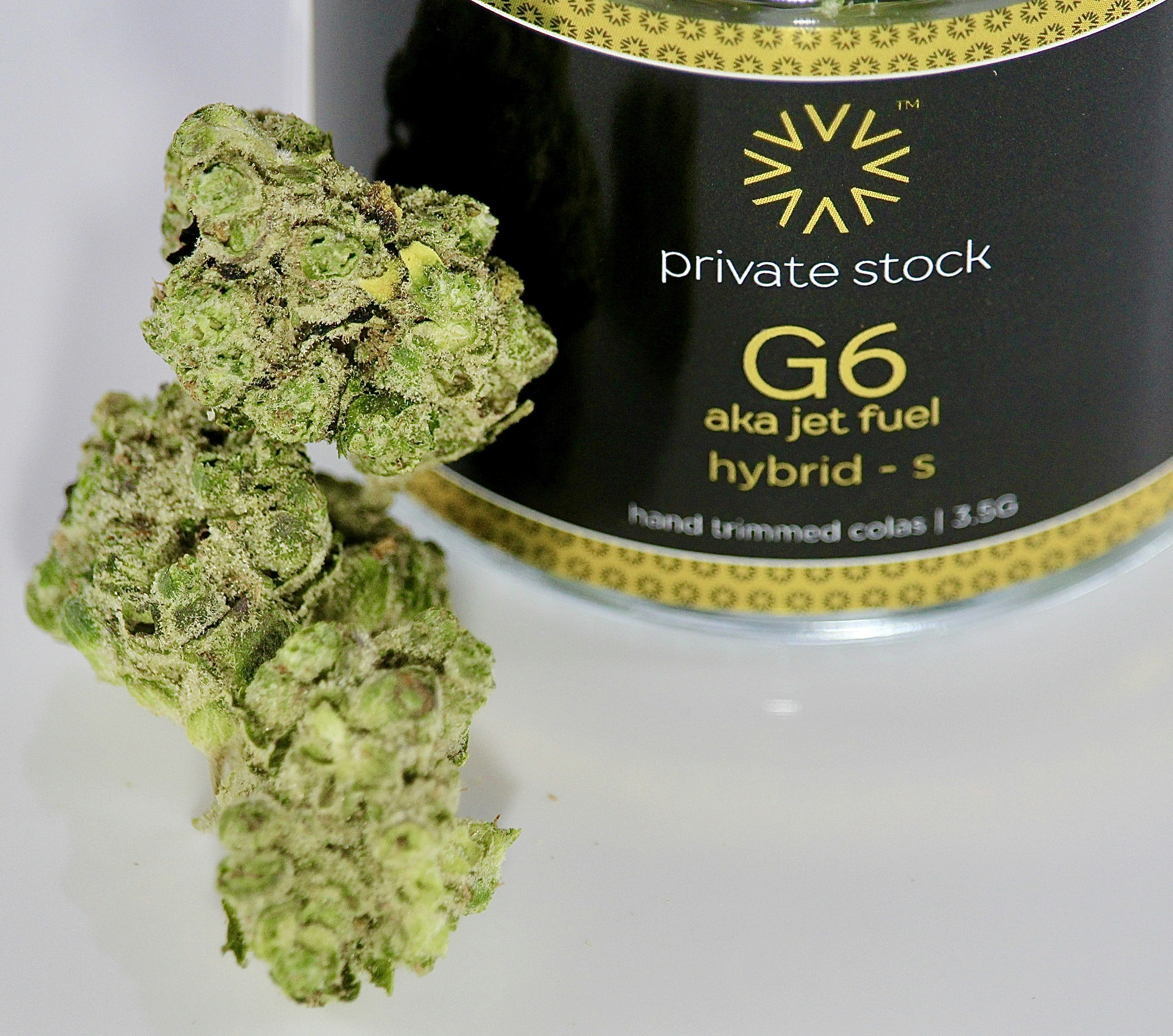
Foil stamp · Matte laminate · Humboldt Harvest Co.
Detail Work · 01
The foil stamp that earns the shelf.
California's BCC requires every retail cannabis package to carry a state-mandated universal symbol — a red diamond with a cannabis leaf — at no smaller than ¼ inch on the primary display panel. Most designers treat it like a footnote. We treat it like a design constraint worth solving.
On the Humboldt Harvest Co. flower pouch, we nested the symbol into a debossed panel that reads as intentional rather than appended. The foil stamp on the cultivar name runs a Pantone 871C warm gold, chosen to complement the terracotta clay tones of the outer sleeve without competing with the compliance mark.
The result cleared BCC review on first submission — no revisions, no back-and-forth. That's not luck. That's knowing the §26120 placement rules before the designer opens Illustrator.
Child-resistant closure · Concentrate jar · Pineridge Extracts
Compliance Detail · 02
Colorado MED wants the mg on the front.
Colorado's Marijuana Enforcement Division requires the total THC milligrams per package — not per serving, per package — on the principal display panel in a minimum 6-point font, immediately adjacent to the product name. Edibles must also show the per-serving amount in a separate disclosure.
For Pineridge Extracts' live resin line, that meant designing a front panel that led with the extract name and cultivar in Fraunces Italic, then dropped into a clean compliance block in DM Mono at 7pt. The hierarchy works because the compliance text is set in the same warm sandstone as the background — present and readable, not shouting.
We also spec'd the child-resistant closures to ASTM D3475 certification. The closure manufacturer's spec sheet goes into the production file as a linked asset, so printers and co-packers always have the current certification number without calling us.
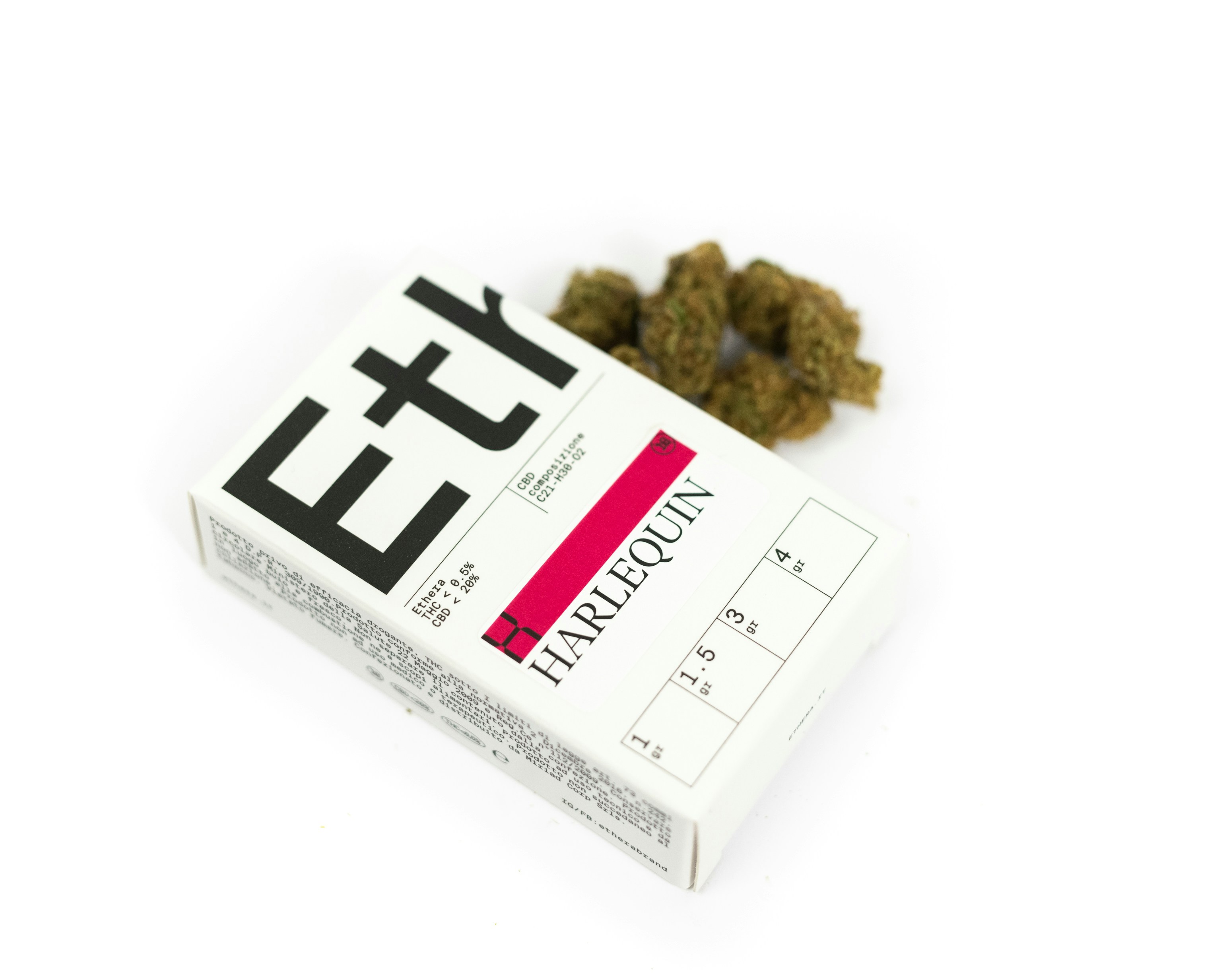
Micro-type compliance panel · 6pt DM Mono · Sage Creek Farms
Typography & Compliance · 03
Micro-type that regulators can read.
Every state has a minimum font size for compliance text. California says 6-point. Colorado says 6-point. Oregon says it must be "clearly legible" — which in practice means 6-point in a medium weight on a light background. We set compliance panels in DM Mono because monospaced type reads more evenly at small sizes and the fixed-width characters make line-length calculations predictable.
For Sage Creek Farms' pre-roll tubes, the compliance panel runs around the circumference of the tube in a single-color matte print. We built a custom template that calculates character count against circumference at each SKU diameter, so the typesetter never has to guess whether the text will fit before the proof stage.
The template also flags any required element that's missing — license number, harvest date, net weight — before the file goes to the printer. Fewer revisions. Faster approvals. Labels that look like someone cared.
Start a Project
Let's design
your line.
Tell us about your brand and we'll come back with a scope that fits your SKU count, operating state, and regulatory requirements — no guesswork, no generic proposals.
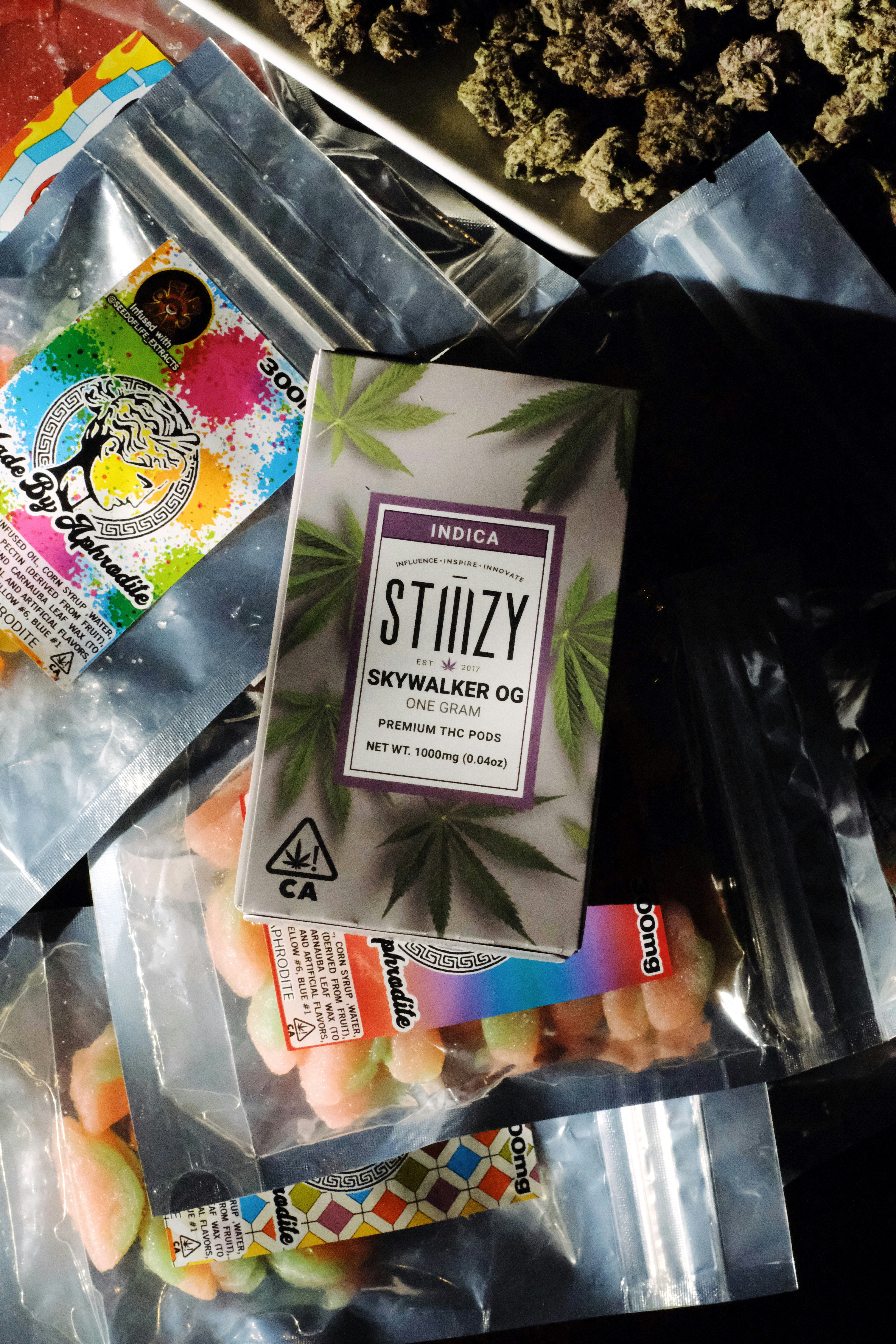
Full line identity · Flower, concentrate, edible · Ridgeline Collective
Brand Identity · 04
One voice across every SKU.
Ridgeline Collective launched with eleven SKUs across three categories — flower, live resin, and a gummy line. The challenge was building a visual system flexible enough that each product felt distinct at the shelf level, but cohesive enough that a buyer picking up the gummy and the flower pouch knew they were from the same farm.
We built the system around a hand-drawn botanical illustration of the farm's specific cultivar leaf — not a generic cannabis icon, the actual leaf shape from their Afghani Kush mother plant. That illustration anchors every label. Category is communicated through color: the same terracotta-to-sandstone gradient shifts to sage-to-cream for edibles, and to loam-to-charcoal for concentrates.
The system is documented in a 24-page brand guide that the Ridgeline team can hand to any licensed printer in California or Colorado and get a consistent result without calling us first.

Emerald Triangle · Humboldt County · Golden hour
Community · 05
Rooted in the Emerald Triangle.
We started in Humboldt because that's where the craft growers are — operators who've been farming the same ridgeline for twenty years and are finally, legally, able to put their name on a label. They didn't need a brand agency. They needed a neighbor who understood what the plant means to them and could translate that into packaging that holds up in a dispensary in Los Angeles or Denver.
That proximity matters. When a new state compliance bulletin drops, we read it the same day. When a grower needs to add a batch number to an existing label design, we turn it around before harvest. When the BCC changes its universal symbol specs — as it did in 2023 — we update every active client's files proactively, not reactively.
We work with growers who have four SKUs and brands who have forty. The process is the same: unhurried, specific, honest. The packaging should feel like it came from the same place as the flower.
The Craft Brand
Packaging Checklist
Free Resource
Not ready to commission yet? Start here.
The Craft Brand Packaging Checklist covers every regulatory requirement you'll face before your first label goes to print — from California's BCC symbol placement rules to Colorado's THC mg disclosure formats. Twelve pages, zero fluff.
Just your email. No sequences, no drip campaigns — we hate them too.
Ready when you are
Your label should be
as good as what's inside.
Craft growers in Humboldt have been handing us their plants and trusting us with their brands since 2018. We know what the BCC wants to see. We know what a farmstand shelf wants to say. Let's make something honest.